Overview
Summary
Data visualization is the graphical representation of data and information using charts, graphs, and other visual tools to make complex data more understandable and actionable. In engineering, it is crucial for analyzing and interpreting large datasets, identifying patterns, trends, and outliers, and effectively communicating findings to stakeholders. By translating technical information into visual formats, engineers can make data-driven decisions more efficiently and identify potential issues preemptively. Data visualization enables engineers to enhance productivity, improve accuracy, and innovate solutions in complex projects.
Learning Outcomes
- Evaluate the features of an engineering graph and its components
- Review the different types of graphs available for engineering
- Recognize the importance of data visualization in engineering
Data Visualization
Creating effective visualizations is about more than just the data. Communicating your analysis means making careful decisions about the design of your charts and graphs to help you tell a story with the data.
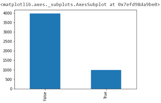
For example, this bar chart shows us the information we need, but it isn’t descriptive or visually appealing.
This chart shows the number of land animals (True, on the right) and the number of air animals (False, on the left) that were struck by aircraft in North Carolina. However, if you were looking at this for the first time, none of that would be clear.
We could redesign this visualization to make it better!
Chart Types
When creating a visualization you must consider how you want to represent your data graphically. There are two main considerations:
- What type of data do you have? (categorical, numerical, textual, more than one?)
- What is the function of chart? What story are you trying to tell with this chart?
Bar Charts
Function: comparison
how alike or different are these data?
Data Types: categorical, numerical
Line Chart
Function: change/trend
how do these data change over time?
Data Types: numerical
Choropleth Map
Function: comparison
how alike or different are these data?
Data Types: spatial, numerical
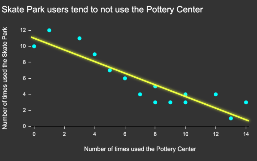
Scatter Plot
Function: relationship
do these data change when those data change?
Data Types: numerical
Check out The Data Visualisation Catalogue to help identify chart types that could be relevant for your data.
Color in Data Visualizations
Color can be leveraged in creating data visualizations, but there are a number of things to consider when selecting colors:
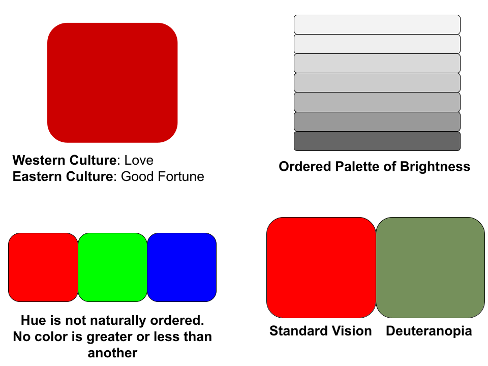
- Color has cultural associations (example: red and blue have political connotations in the US)
- When visualizing quantitative data, use an ordered palette. An ordered palette can be a brightness ramp (e.g., light to dark shades of grey, blue, or red) or a hue ramp (e.g., cycling from light yellow to dark blue). In general, people interpret darker colors as representing “more.”
- Hue is not naturally ordered. We don’t see one color as being inherently bigger or smaller than the other, and so to use this to represent quantitative data is a mistake.
- Consider accessibility: some color combinations aren’t effective for viewers with colorblindness.
Reference: [1]
Text in Data Visualizations
Text plays a crucial role in data visualizations by providing clarity and meaning to visuals. Labels, titles, captions, and annotations help viewers understand what the data represents and reduces ambiguity. Without concise text, even the most visually compelling charts or graphs can be misinterpreted.
When adding text to data visualizations, you should:
- Choose fonts that are easy to read.
- Give text empty space around it (especially in boxes).
- Keep type horizontal.
- Be consistent with your font choices.
- Make sure your visualization is clearly and consistently labeled (all axes, and a title).
Reference: [2]
References
[1] Cahoon, C. Using color in data visualizations. Panopto. https://ncsu.hosted.panopto.com/Panopto/Pages/Viewer.aspx?id=3e4b16f7-f4fe-4273-acf2-ad50012e60f0&start=0 (accessed 2025-01-29).
[2] Cahoon, C. Using Type and Text in data visualizations. Panopto. https://ncsu.hosted.panopto.com/Panopto/Pages/Viewer.aspx?id=84c941de-9e04-431c-bf6f-ad5001308c5b&start=0 (accessed 2025-01-29).